Brand identity is critical to the success of an online business. I wanted a logo that would be simple, distinctive, and evocative of the company name.
The inspiration was immediate and, perhaps, obvious: a series of commas.
The first task was to find a comma that looked good when enlarged. I chose the Perpetua Titling typeface. Figure 1 shows my first attempt: four commas arranged horizontally, with progressively darker shades. I chose purple because it matches the dominant color of the website template I plan to use.

Not bad, but it didn’t seem very dynamic. For version 2, I arranged the commas diagonally.

Better, but too busy and the shade of the lightest comma seemed too light. For version three, I eliminated one of the commas.

That looked good, except the main shade of purple looked a bit washed out. For the final version, I selected a slightly darker shade from another source (which I will explain later).

For the version of the logo with the company name (seen at the top of this post), I chose to put the logo between the words for balance. I tried a version with the logo followed by the words but it didn’t feel right. The typeface of the words is also Perpetua Titling.
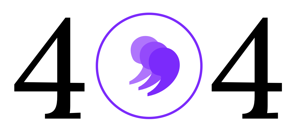
The shape of the logo also allows for some fun. Although I hope you never see this in its rightful place, here is the logo as it appears in the 404 page of the website.
By the way, I created all versions of the logo in PowerPoint.