
Having selected the typefaces for the project, the next tasks are to determine how the font sizes will scale for different typographic elements on the page and how the lines of text will be spaced.
Scaling Type
There are two basic approaches to scaling the type on a web page: choose the sizes manually or choose them according to a formula. Choosing the sizes manually sounds like something best left to skilled typographers because every choice will require a judgment. If you read my Choosing Typefaces post, you will know that I prefer an approach that involves a decision framework; an approach that requires a judgment at every step is not following a decision framework in my mind.
A common approach to scaling type with a formula is to use a ratio: the size of type at one level is multiplied or divided by the ratio to determine the next larger or smaller size. For example, if the base type size is 16 pixels and the ratio is 1.125:1, then the next larger size would be 18px and the next smaller size would be 14.222px.
So what ratio to choose? Not surprisingly, many theories abound for what the “right” or “perfect” ratio is. One theory uses the so-called golden ratio, which is about 1.618:1. There is a helpful website called the Golden Ratio Typography (GRT) Calculator that will do the math for you.
Other theories look to musical scales for typographic inspiration, the rationale being that pleasant harmonies in music should translate into pleasing typographical layouts. There is perhaps more logic in that approach than it would first appear, because musical theory is highly mathematical. The Modular Scale website implements this theory and will demonstrate how a base font size will scale up or down based on different musical intervals (perfect fifth, minor third, etc.). It also includes the golden ratio, if you wish to compare.
I wanted a scale that would provide meaningful differences between each font size in the scale but not so big that the larger sizes become enormous. I thought the golden ratio fell into the latter category. I anticipate having body text, three levels of headings, two levels of smaller type for captions and legends, and perhaps one super large size for display. That’s seven sizes of type. The golden ratio results in the smallest size in the sequence being about 20 times smaller than the largest size. And if the body text is 20px, the second largest size (which I would use for <h1> headings) would be 84px. That seems too large.
After playing around on the Modular Scale site, I settled on a ratio based on a major third musical scale. Mathematically, the ratio is 2^(1/3), or about 1.26:1. Both the image at the top of the page and Figure 1 illustrate how type scales using the major third ratio. Figure 1 uses Sarabun for all sizes except the body text, which uses Lora. Note that Figure 1 is intended to depict relative sizes only; the sizes depicted may be larger or smaller than their actual sizes depending on the display you are reading this post on.
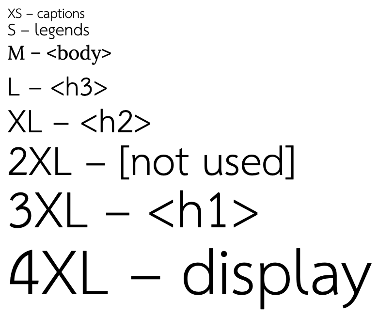
Note that I skipped a level for the <h1> heading. I originally used size 2XL, but it didn’t seem to be sufficiently distinguished from the rest of the text on the page. So even using a formula, there is some room for judgment. 😉
Line Length
Line length is the distance from the left edge of text to the right edge. In general, shorter lines of text are easier to read than longer lines. For a website that uses little text, line length may not matter. For a text-focused site like this one, the comfort of the reader is all-important.
In an instance of rare agreement, the typographic community appears to have settled on an average line length of between 45-90 characters as the ideal target. (See, eg, Typography for Lawyers.) Granted, that’s a broad range, but it’s useful guidance.
If you have a tool that counts characters and lines you can easily compute average line length. If you don’t have such a tool, you can simply repeat the alphabet as an approximation:
abcdefghijklmnopqrstuvwxyzabcdefghijklmnopqrstuvwxyzabcdefghijklmnopqrs
At its widest setting on my laptop, the line length of this post is about 71 characters, comfortably within the recommended range.
Accessibility Note
WCAG 2.1 specifies a line length of not more than 80 glyphs to achieve Level AAA compliance. There are no level A or AA criteria.
Line Height
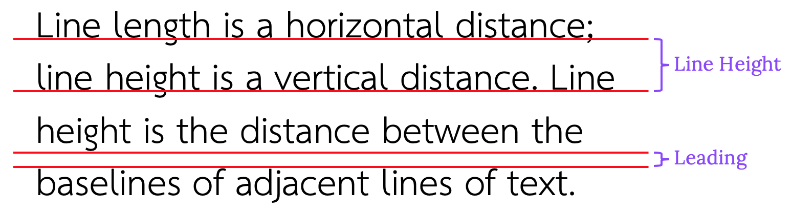
Line length is a horizontal distance; line height is a vertical distance. Line height (also called line spacing) is the distance between the baselines of adjacent lines of text. Leading (rhymes with sledding) is the distance between adjacent lines of text. Figure 2 shows how to measure line height and leading.
Line height for websites is usually expressed as a multiple of font size. For a font size of 16 pixels with a line height multiple of 1.0, the line height would be 16 pixels. If the line height multiple was 1.5, the line height would be 24 pixels. (Note, however, that line height can be expressed in any unit – px, em, rem, etc.)
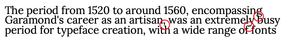
Line height cannot be chosen in isolation, or at least it shouldn’t be. For body text, the objective is to choose a line height that enhances the legibility of the text. If the line height is too small, the ascenders in the lower line can interfere with the descenders of the upper line, as in Figure 3.
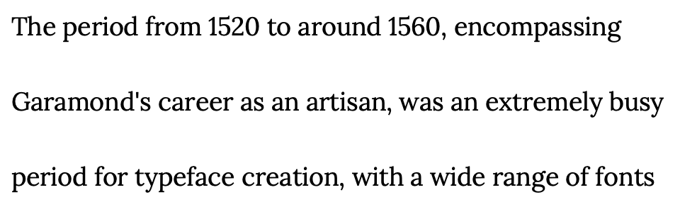
At the other extreme, if the line height is too large the text can look disconnected and the eye can get lost tracking to the next line, as in Figure 4.
Those examples illustrate extreme choices relative to font size, but other factors must also be taken into account. For example, longer line lengths generally require slightly larger line heights, as do fonts that are darker or denser than others. Larger font sizes generally require smaller line heights (relative to font size). One typographer has suggested thinking of font size, line length, and line height as three sides of a triangle, with the goal to balance the sides as closely possible. When one side changes, the other sides may also need to change to keep the triangle balanced. It’s a useful model.
Putting all this together, most online resources recommend line heights of between 1.3 and 1.7 times font size. The text you’re currently reading is set at a 1.5 multiple, which seems about right.
Accessibility Note
WCAG 2.1 specifies a line height of at least 1.5 times the font size to achieve Level AA compliance.
As a final note, although it would appear that leading is a single chunk of white space between the lines (see Figure 2), that is not how line height is implemented in web browsers. As Figure 5 shows, the leading (L = line height – font size) is distributed equally above and below the text (as ½ L).
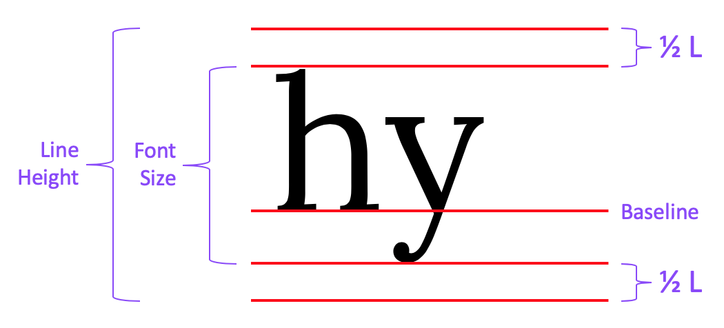
Keep this in mind if the spacing above and below blocks of text is not behaving as you expect on your web page.
Paragraph Spacing
Unlike the other topics in this post, I found very little guidance online regarding best practices for the spacing between paragraphs. If the topic was addressed at all, it was usually an afterthought along the lines of “add enough extra space so that the separation is obvious but not so much that the overall flow of text is disrupted”. The only concrete recommendation I found was to use 50-100% of the font size as additional spacing between paragraphs. So I would suggest starting there and tweaking it to please your eye.
For the page you’re reading, I added a bottom margin equal to 100% of the font size to each body text paragraph. Combined with the leading from the paragraphs themselves, that creates a total space between paragraphs equal to one blank line.
Accessibility Note
WCAG 2.1 specifies spacing following each paragraph of at least 2 times the font size to achieve Level AA compliance.