A consistent theme you will see in this blog is my search for decision frameworks. I am frustrated by design websites that say “the best choice for X is Y” without saying why Y is the best choice or whether Y would also be the best choice for X' or Z. Chances are good that my requirements will be different, so please give me principles I can follow to make intelligent decisions for my situation, or that will at least start me in the right direction.
This is particularly true for typography. I love typography—I have read a dozen or so books on the topic and eagerly read articles about it when I find them. I’m knowledgeable about the technical aspects of typography, but I struggle with one of the most important design aspects at the outset of a new project: choosing typefaces.
This post presents a framework for choosing typefaces for a project. It is by no means definitive, but it helps to make the process less arbitrary.
Sources of Fonts
Free fonts can be found all over the web. Here are three of the best sources I have found:
Note that only a few of the fonts on MyFonts are free, but if you’re not satisfied with your choices on the first two sites, you should be able to find something suitable from among the 130,000+ fonts on MyFonts.
Design Constraint and Objective
This article describes the decision framework I followed to choose the typeface for the body text of this blog. This blog is built with a Jekyll template that relies on Google fonts, so I will limit my search accordingly to avoid having to make major changes to the template.
I want the typographical look & feel of this blog to be crisp and unfussy but finished. To achieve that objective, the typefaces must be easy to read on all screens, with enough features to make the typography distinctive but without unnecessary flourishes or quirky letterforms.
Decision Framework
My decision framework is a process of elimination: start with all the available fonts, then eliminate those that fail various tests. Unfortunately, I was not able to find a font selection tool online that allowed filtering by more than a few of the most basic attributes of a font, so my framework is mostly a manual process.
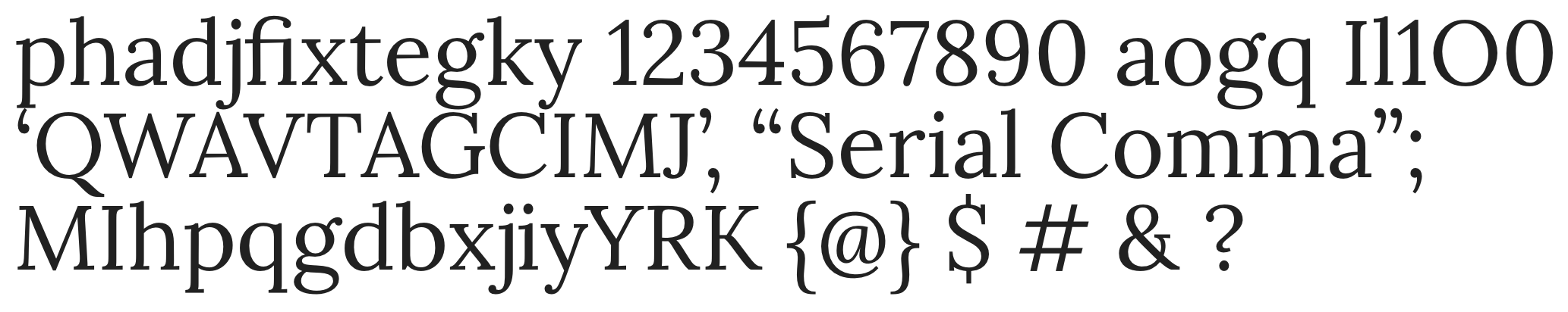
Sample text string
All three sites allow you to put in your own string of text to see how it appears in different fonts. You can use a string from your project, or “The quick brown fox …”, or the classic “Lorem ipsum”, or anything else that will help you decide. Here is the string I use:
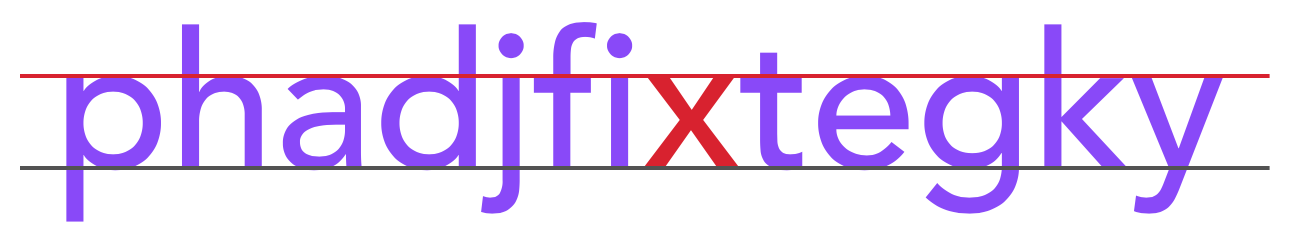
phadjfixtegky 1234567890 aogq Il1O0 ‘QWAVTAGCIMJ’, “Serial Comma”; MIhpqgdbxjiyYRK {@} $ # & ?
There is a method to my madness, as you will see.
Type class
There are five basic classes of type: serif, sans serif, display, monospace, and script. For the body text of this blog, monospace—which allots the same space to each character, like a typewriter—won’t work because it seems unfinished. Script fonts won’t work because they’re too fussy and hard to read in lengthy blocks of text. Display fonts are for headlines and short snippets of text.
The debate rages whether serif or sans serif fonts are better for body text. I won’t revisit that debate here. My personal preference is a serif font for blocks of text, so that is where I will start my search.
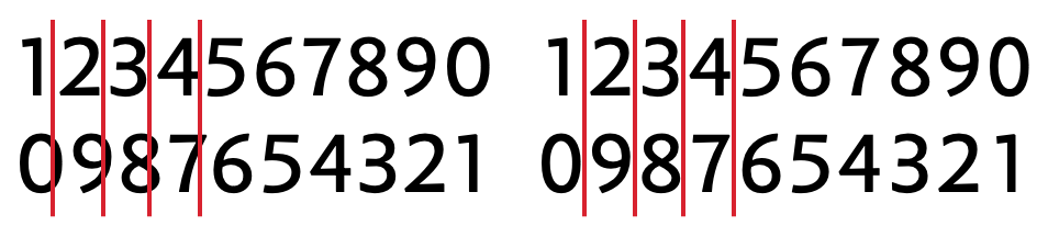
x-height
The x-height of a font is the height of the lowercase x, as illustrated in the image at the top of this post. The characters in that image—from the beginning of my sample string—are intended to show the height of the x character relative to other characters with ascenders and descenders. That’s because the relative x-height is what is important for readability. In general, for smaller font sizes, fonts with a larger x-height will be easier to read because the features of the letterforms will be more easily distinguished.
Here are two examples of serif fonts of the same font size with different x-heights. (The examples I show will not necessarily use fonts available in Google Fonts.)
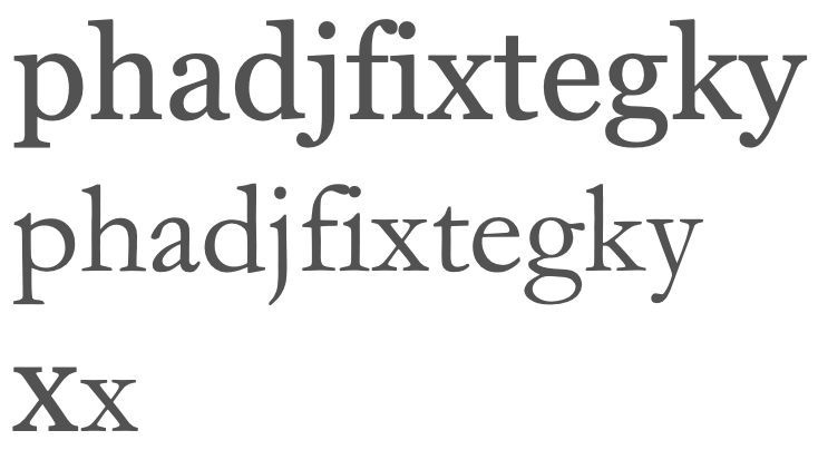
Not only is the absolute x-height of Georgia, the top font, larger, but its relative x-height is also larger (which can be seen by comparing the lengths of the ascenders and descenders of the p, d, and k to the overall heights of the latters).
All other things being equal, I’ll be looking for fonts with larger x-heights.
Number style
There are two styles of numbers: old style and lining. Old style numbers are like lowercase letters in that they have an x-height, ascenders, and descenders; lining numbers are all the same height as capital letters. Either style can be proportional, which blends more smoothly with surrounding text, or tabular, which line up in columns. Here are examples:
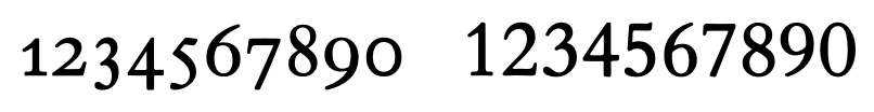
I find old style numbers to be fussy and I anticipate I will rarely present numbers in columns, so I prefer lining proportional numbers for this blog.
Distinguishing characters
The first block of characters in the sample string enables two other quick checks. The first is whether the lowercase a and g characters are single story or double story, as illustrated here:
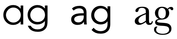
The first example shows two single story characters. The second example shows a double story a and a single story g. The third example shows two double story characters.
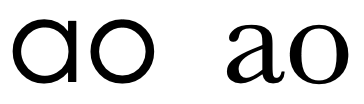
Why does this matter? The double story a and g are unambiguously distinguishable from the o and q characters respectively. See how difficult it can be to distinguish the a from the o in the first set of characters below compared to the second.
I prefer double story characters for this blog.
Appearing next in my sample string are the characters Il1O0. This enables a quick comparison of the capital I, the lowercase l, and the number 1 and the capital O and the number 0 to see if they are readily distinguishable. This can be an issue, particularly with some sans serif fonts.
Capital letters
The next block of characters in my sample string are capitals enclosed in single quotes and a comma. These characters enable several quick checks.
First, is there anything funky going on with the capital Q or capital W?
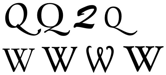
Bottom row L-R: Garamond, Goudy Old Style, Harrington, Hoefler Text
Those examples are not aligned with my objective of being crisp and unfussy.
Second, I look for unbalanced space between the WAG and the TAG. Letter spacing on most modern fonts is excellent, but occasionally things just don’t look right.
Third, I see whether the capital G and C are easily distinguished and if I’m happy with the way the G is finished.
Fourth, I see whether the sides of the capital M are straight or slanted and how that wide letter looks between the narrow I and J. I also look at how the bottom of the J is finished. Sometimes the J has a descender or is finished plainly or with a flourish.
Finally, I look at the single quotes and the comma to see if I like their shapes and how they are spaced relative to the characters they are next to.
Our Name
Next up in my sample string is the company name enclosed in double quotes and ending with a semi-colon. Because our name is our most valuable brand asset, I want to make sure our name looks good in the font I ultimately choose. I also look at the double quotes and the semi-colon to see if I like their shapes and how they are spaced relative to the characters they are next to.
Other Quirks?
In the final block of letters, I’m just looking for quirks. How do ascenders compare to the height of capitals? How do the bowls on characters with bowls look? How do the descenders look on the j and the y? Are the dots above the lowercase i and j circles, squares, or something else? Finally, how are the character shapes and the spacing for the capital Y, R, and K?
At the end of the sample string are several common symbols. Are they nicely formed and consistent with letters and numbers, or are they quirky? The at sign and the ampersand are often candidates for the artistic expression of the font designer, so be sure their taste matches yours.
My Selection
After following the decision framework I just described, I chose the Lora typeface in Google Fonts. Here is the sample string in Lora:
A quick recap of my thought process resulting in this choice:
- It’s a serif font.
- The x-height is reasonably high but not unusually so.
- The numbers are lining, nicely formed, and very crisply drawn.
- Double story a and g mean no issues distinguishing them from the o and q.
- I, l, and 1 are easy to distinguish, as are the O and 0.
- The descender on the Q is a little longer than I’d like but not unacceptably so.
- Capitals are nicely spaced.
- G and C are easily distinguished.
- The legs on the M are slightly slanted which gives some character.
- The end of the J is nicely finished.
- Punctuation is nicely formed (for this blog I prefer quotes and commas with embedded dots, not just slashes).
- The company name looks great.
- No quirks among the characters. Dots on the i and j are circles, which is good, and the descenders on the j and y are nicely finished.
- Symbols look good; @ and & are restrained; ? is great.
End result: crisp, unfussy, finished.
What do you think? You’ve been reading this post in Lora.
For Further Reading
Understanding typography – Material Design. An excellent concise introduction to the concepts and terminology of typography.
How to Choose a Font for a Project – betterwebtype.com. A structured approach to choosing a font.
To choose the right typeface, look at its x-height. – Medium. The inspiration for this article’s illustration.